

Website design for photographers and studios should do one thing well: make the pictures look worth booking. If the home page loads slowly, hides the best work, or buries the contact details, people move on and they do it quickly. We build photography sites so the work leads, the enquiry path stays obvious, and the whole page still feels light on a phone.
This matters even more for studios that work with local families, bridal clients, product sellers, and small businesses across Kanyakumari District and nearby towns. Most of those visitors are checking you on mobile data, between calls, on the way to a function hall or after seeing your name on Instagram, so the site has to answer their questions fast.
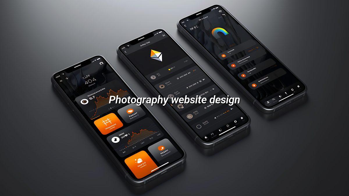
Portfolio first, friction last
What a good photography website has to do
A serious photography website does more than show a gallery. It has to prove your taste, explain what you shoot, and make the next step simple whether that means a call, a WhatsApp message, or a short quote request. People shopping for a wedding photographer are usually anxious, and product clients are usually pressed for time, so the site needs to reduce doubt instead of adding more of it.
Show the work in the right order
Put the strongest images near the top, then group the rest by service or theme. A wedding studio should not mix reception shots, newborn portraits, and corporate headshots in one long scroll unless there is a clear reason for it. Visitors scan before they read, and if they cannot tell what kind of photographer you are, they close the tab.
Explain the service without making it sound like a brochure
Most people do not want a grand speech about creativity. They want to know what happens on the day, how many locations you cover, whether you work from a studio, and how they can see examples similar to their brief. For a studio in Nagercoil, that might mean one page for portraits, another for family events, and a separate page for product or commercial work. Simple. Clear. No guessing.
- Use full-width hero images only when the file size is controlled.
- Label galleries by service, event type, or shoot style.
- Keep enquiry buttons visible after every major section.
- Write short captions that tell people what they are looking at.
- Make the site readable without zooming on a phone.
A practical build process for studio sites
When we plan website design for photographers and studios, we start with how people actually choose a photographer. Some arrive with a date already fixed. Others are comparing a few studios and looking for style, not just a list of services. The site should match those habits instead of forcing every visitor through the same path.
- Pick the main job of the site. Decide whether the site is meant to book weddings, sell studio sessions, attract commercial clients, or do all three with separate paths.
- Sort the image library. Choose the work that proves your style best, then remove anything that feels repetitive, blurry, or off-brand.
- Write the service pages. Explain what each shoot type includes, how long it usually takes, and what the client should send before the session.
- Shape the enquiry route. Place one clear action near the top, repeat it later, and keep the form short enough that people finish it on the spot.
- Test the site on mobile data. Open it on a phone, not just a laptop, and check whether the photos still look sharp without making the page heavy.
What slows these sites down
Image weight is the obvious problem, but it is not the only one. Sloppy sliders, oversized background videos, too many fonts, and fancy animations can all make a simple studio site feel awkward. We see this a lot with small businesses that want the site to look premium, then accidentally load it up with extra decoration that helps no one. The fix is not to strip out personality, it is to keep the personality where people can actually see it.
| Element | What it affects | Why it matters |
|---|---|---|
| Gallery structure | How quickly people understand your style | Mixed galleries confuse visitors and make the site feel unfocused |
| Image file size | Page speed on mobile data | Large files can make the home page drag before the work even appears |
| Service pages | Search visibility and enquiry quality | Separate pages help people find the exact shoot type they want |
| Contact layout | Number of enquiries you actually receive | Clear buttons and short forms reduce drop-off |
How visitors judge a photography site in seconds
The first judgment is visual, but it is not only about beauty. A visitor wants to know if your work feels consistent, whether your style suits their event, and if you look organised enough to trust with a once-in-a-lifetime shoot or a paid commercial brief. If the site is messy, they assume the process will be messy too.
Different clients look for different signs
Bridal clients often want reassurance: are there enough album examples, do you cover candid and posed work, can they reach you without a long call? Product clients care about clarity and colour accuracy, and they often scan for studio lighting examples or packshot work. Families want warmth and patience, usually without reading a wall of text. Same business, different expectations.
That is why one long generic page rarely works. A better site gives each audience a place to land and a fast way to see the right examples. Even a small studio can do this well if the pages are organised honestly and the photos are edited with restraint.
Local habits matter more than people expect
In places like Nagercoil, Tirunelveli, Madurai, or Coimbatore, many customers still ask around before they fill in a form. They may see your work on WhatsApp, then check the site to confirm you are real and active. A neat site with a proper address, working contact options, and recent-looking portfolio pages can do more than a loud advert ever will. That is just how people check trust now.
How Webglits can help
We design photography websites the way we build most small-business sites: clean structure, fast loading, and no dead weight. If you need the site to support portfolio browsing, enquiry forms, or a simple studio landing page, we can shape it around the real job instead of forcing it into a generic template. We also help with website design and SEO when the site needs to attract the right people from search, not just sit there looking nice.
Call +91 90430 22255, message us on WhatsApp, or email [email protected]. We are in Nagercoil, Tamil Nadu, Mon–Sat 9am to 6pm.
Common questions
Questions photographers ask before starting
What should a photography website include to get enquiries?
It needs a short home page, a clean portfolio, clear service pages, and an easy way to contact you. People should see your style in a few seconds and know how to book without hunting around. If they have to dig for your phone number or WhatsApp link, they usually leave.
Do photographers need a separate page for each service?
Yes, if you do different kinds of work. Wedding, product, maternity, studio portraits, and commercial shoots all attract different searches and different questions. Separate pages help people find the right fit faster and they make the site easier to read on a phone.
How many photos should a studio website show on the home page?
Enough to prove your style, not so many that the page drags. A small set of strong images works better than a giant wall of thumbnails, especially for visitors on mobile data in places like Nagercoil or Madurai. The full gallery can sit lower on the page or on dedicated portfolio pages.
Is a fast website important for photographers?
Very. Large image files can slow a site down badly, and most visitors will not wait around for it. We build with image handling and page structure in mind so the work looks sharp without making the site heavy.
Can I update my own gallery after launch?
You should be able to, yes. Most photographers want to swap featured work, add a new album, or change a banner without calling a developer every time. We set sites up so the owner can keep control of the images and text.
What if my studio also sells prints or packages?
Then the site should explain those clearly and keep the buying path simple. You do not need a cluttered shop if you only sell a few items, but you do need clear pricing language, enquiry steps, and a way to ask questions before booking.
A photography site does not need to be noisy to work. It needs to be clear, fast, and honest about what kind of work you do. If you want website design for photographers and studios that helps real people choose you without wrestling with the page, we can build that sensibly and keep the controls in your hands.

Replies within 24 hours
Tell us what you need
Share your requirement and we will send a tailored quote within 24 hours. No obligation, no pressure — and you talk to the people who would actually build it.